The first post in this series described how my Mac ran a small product studio for eleven days: launchd, a skill file, a folder of TSVs, and coding agents reviewing each other. This one is about the part I cared about most and that was hardest to automate: whether the products were any good.
The short version: I turned taste into a ten-axis score, made the score mandatory, and watched agents meet it. Then I looked at what they had made and kept about half. The score was useful. It just measured something other than what I meant.
The first product was fine
The Lab’s pilot run took 55 minutes from an empty folder to a live URL. It built antipoda-fm, which finds the place on the exact opposite side of the Earth from you and tunes into a live radio station near it.
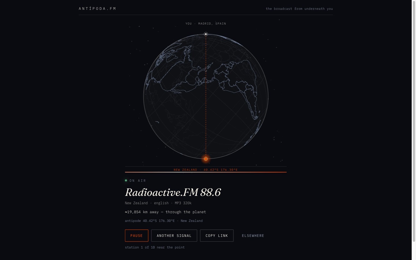
It worked, and it was tasteful. It was also static. A row of outlined, uppercase, monospace buttons, a flat globe, nothing that moved because you touched it. I told the coordinator, the Devin chat that built and ran the Lab with me, that I wanted more delight: “cosas más llamativas y chulas … que transmitan esa sensación de craft y cariño y mimo para los detalles de uso”.
That sentence became a set of rules. Every brief now names a signature moment that lands in the first ten seconds, and lists at least eight small details of delight. Every run explores two or three directions as throwaway pages before choosing one, hunts for real components and techniques before hand-rolling generic ones, and builds a first-run guide that teaches by doing rather than a modal with a Next button.
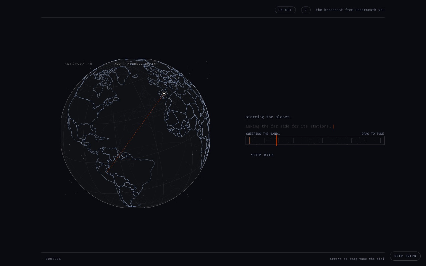
The redesign that followed is still the product’s core: the planet opens into a molten cutaway while a probe falls through it, with the depth counting in real time.
Making taste checkable
Rules in a skill are prose, and agents read prose generously. So taste had to become something a script could check.
The design review runs on a model from a different family than the builder. Codex reviewed what Devin built, and Cursor took over when both Codex accounts were resting. The reviewer gets screenshots at 1440px and 375px, a recording of the first ten seconds, and a brief that casts it as a demanding design engineer at a top studio. It scores ten axes from 1 to 10:
- First impression
- Signature moment
- Feel of direct manipulation
- Spectacle, meaning “how did they do that?”
- Motion quality
- Micro-interactions
- First-run guidance
- Typography and layout
- Originality, both against stock components and against earlier Lab products
- Mobile
For every score under 8, it names three concrete changes. A script, design-gate.py, passes only when all ten are 8 or more and the review was made on the commit that ships. The first post shows its code. It became a script because agents kept finding reasons around the prose version. One shipped with five sevens because “every finding was fixed anyway”.
I also gave the Lab people to learn from. I pointed it at Lochie Axon’s work at Family: torph for text that morphs through shared letters, and web-haptics for haptic feedback on the mobile web. I added Benji Taylor’s essay Family Values, and the published thinking of Emil Kowalski and Josh Puckett. The coordinator read them and wrote seven rules into the skill’s taste file. Two did most of the work. “Nothing teleports”: labels, counts and prices morph instead of swapping. “Spend delight on the curve”: small touches for frequent actions, and memorable ones for rare moments like the first run, an empty state, or sharing.
What the gate caught
The gate was good at the things it measured.
- Layouts that didn’t fit. Plinks, a bean machine that turns a word into a melody, needed page scroll at every desktop size. A separate script,
viewport-check.mjs, now fails on that before a design review even runs. - Sameness. Two of the first products shared the same outlined button row. The reviewer now gets the hero screenshots of every shipped product and deducts a point for each element that looks borrowed. That outlined button row is banned by name.
- Unfinished edges. Empty states, error states, offline states, reduced motion, focus rings. Products that passed the gate rarely had a dead corner.
What the gate got wrong
It punished the wrong product
The sameness rule had a bug in its logic, not its code. During a redo of antipoda-fm, the reviewer docked it to 4 on originality for “six visible design-language matches” with Plinks. Plinks had been built after antipoda-fm, and partly in its image. The run did what the score asked and redesigned antipoda-fm away from its own identity. The result was a small boxed receiver in the middle of an empty screen.
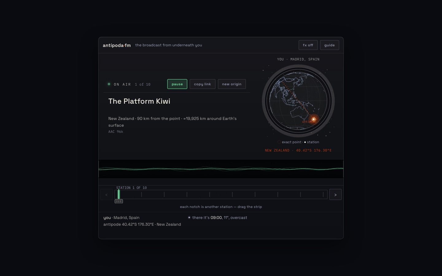
I said the layout had got “MUCHÍSIMO” worse. The coordinator built the previous design with the one real fix from that round, a Safari audio bug, and served it on localhost next to the live redesign. I picked the old one in about ten seconds.
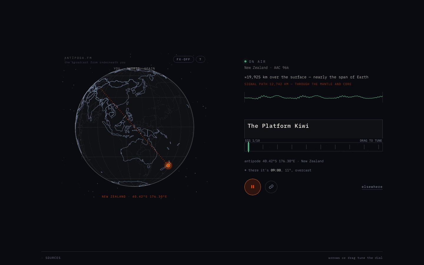
Three rules came out of that. Originality is judged only against products that shipped earlier. A redo does exactly what its entry asks, so a bug gets a fix and not a redesign. Any axis that scores lower than the version you started from counts as a regression and blocks shipping.
It measured execution, not ideas
Laureate mints a Nobel-style medal and diploma for an absurdly specific achievement. It passed with a mean of 8.62 after ten review rounds: a struck gold medal, a sealed parchment diploma, a committee voice. I found it “bastante cutre”, cheap-looking. The skeuomorphism slid into kitsch, and the idea itself was a template wrapped around a sentence. The rubric had no axis for “is this worth making”. It scored how well the thing was made.
So the gate moved earlier. An ambition gate in the picking step now rejects any idea without a real system underneath, without output that changes on every visit, and without a technical centrepiece worth explaining. Later a look gate went in before any product code: the chosen direction is reviewed against every shipped product’s hero, and it needs 8 or more on first impression, signature moment and originality. Four flagships in a row had died at the final gate after 10 to 24 hours each. The look gate makes the same call in an hour.
It got harder to pass every day
Originality against the Lab’s own portfolio is a moving target. With two products, there is a lot of room. With ten, every dark field, gold focus colour, or bottom control bar resembles something. On October 15 the look gate rejected twelve pitches in a single day. A gate that rejects everything has stopped measuring the work and is only reporting the size of the portfolio.
When I later archived the products I didn’t want, they also dropped out of the comparison set. That alone made the gate fairer.
Rounds became a sink
A gate without a budget becomes a loop. yesca, a GPU wildfire on real terrain, took 19 design rounds. traza took 11. Each round is a 10 to 20 minute review plus fixes, so these loops took most of a day. The fix was a hard cap of three improvement rounds plus one confirmation. After that, a product that is close, with no axis under 6 and a mean of at least 7, is parked with a preview URL for me to decide, instead of being abandoned or polished forever.
What I actually valued
After a week I sat down with everything that had shipped and ranked it. I kept antipoda-fm, mellizo, traza, greets and nullius, plus yesca and maqueta for their engineering. The others I archived, made private, and removed from Vercel. My notes from that review were blunt: “a todos los veo que podrían irse al garete”. All of them could go.
The products I kept had little in common in their scores. Several passed with all eights, and one I kept ran at a mean of 7.25. What they shared was something the rubric never asked about:
- antipoda-fm has a real system underneath and a sense of wonder that survives the second visit: the station, the hour and the weather on the other side are different every time.
- mellizo finds your photo’s twin among museum artworks. I loved the style and said so, then added that it didn’t do much: “simplemente salen obras y ya está”.
- greets writes a demoscene cracktro for any name, with plasma, a scrolltext and a chiptune. The look won me over. Then I asked for the second layer it lacked: export to GIF, style controls, and editable messages.
- traza draws agent sessions as a metro map. It parsed my real hackathon sessions correctly, and its replay ran too fast to examine anything.
- nullius is an endless engraved sea chart where the first visitor to reach a pennant names that place forever. Collective, persistent play.
The pattern was depth. Polish got a product past the gate, and depth was what made me keep it. Depth here means controls to shape the result, a way to take it with you, a reason to come back, and tools that hold up at a human pace. The design review couldn’t see it, because it looked at screenshots and a ten-second recording. Depth only shows after ten minutes of use.
That became a new section in the taste file, with my words verbatim, and a new check: verify a tool by doing the real job with it, at a person’s pace. greets’ second round had to make three distinct cracktros end to end and export them. traza’s second round had to answer five specific questions about my real sessions in under a minute each.
What I’d keep
- A cross-model review with a script behind it. It removed a whole class of argument, and the products that passed rarely had broken corners.
- Comparisons against the past only, and against a curated set, not everything ever shipped.
- A small round budget, with near misses parked for the person whose taste it is.
- A depth check that someone actually performs, alongside the score.
The score was never taste. It was a floor, and a good one. Above that floor, the only judge that worked was me. The next post in the series covers the failures, including the times the floor itself gave way.